Wednesday, June 30, 2010

Cage Free Contemporaries: Jessica Beeman

ladies, gentlemen and Cage Free Junkies:
here's the scoop, yo.  between Sauce's extended hours at her place of work and my frantic search for the right bridge to live under, we haven't made a lot of new work.  SO i came up with the brilliant idea to promote some of our incredibly talented friends.  for free!  i know, i'm a great guy.  Sauce is a lucky woman.


the first edition of Cage Free Contemporaries features Jessica Beeman, a fellow printmaker from the University of Mississippi.
this kid is talented.  her thesis work is really impressive.  the line work and attention to detail in the imagery are just spectacular.  her artist statement and each print's title add a somber, introspective  note to the work that draws you in. check out her artist statement:

"I feel an attraction to abandoned buildings.  They have outlasted their usefulness.  They are dirty and decayed.  I find a voyeuristic thrill in being the first in years to enter their bodies and explore their insides.  That thrill gives way to anxiety when discovering time's dismantling effects on the structure.  I am reminded of my own body, and its inevitable decay.

The exposed supports of this building were like bones.  The flesh had long rotted away.  The wood was cracked and weathered, and the wrought iron beams were rusted through.  The entire structure seemed to teeter on the edge of collapse.  It is hollow save a few disintegrating boxes and pieces of trash.  It appeared the soul had long departed from this stripped skeleton, though I could still feel it lingering there.

Rather than produce perfectly accurate representations of the building itself, I create portraits of the melancholy and heaviness of the atmosphere inside.  The images depict the moments in time frozen within the walls, and the profound loneliness that thickens the air.  It is a sobering fact that our bodies are just as vulnerable to the passage of time.  My prints are reminders of the ephemerality of our lives and the ease with which we are forgotten."

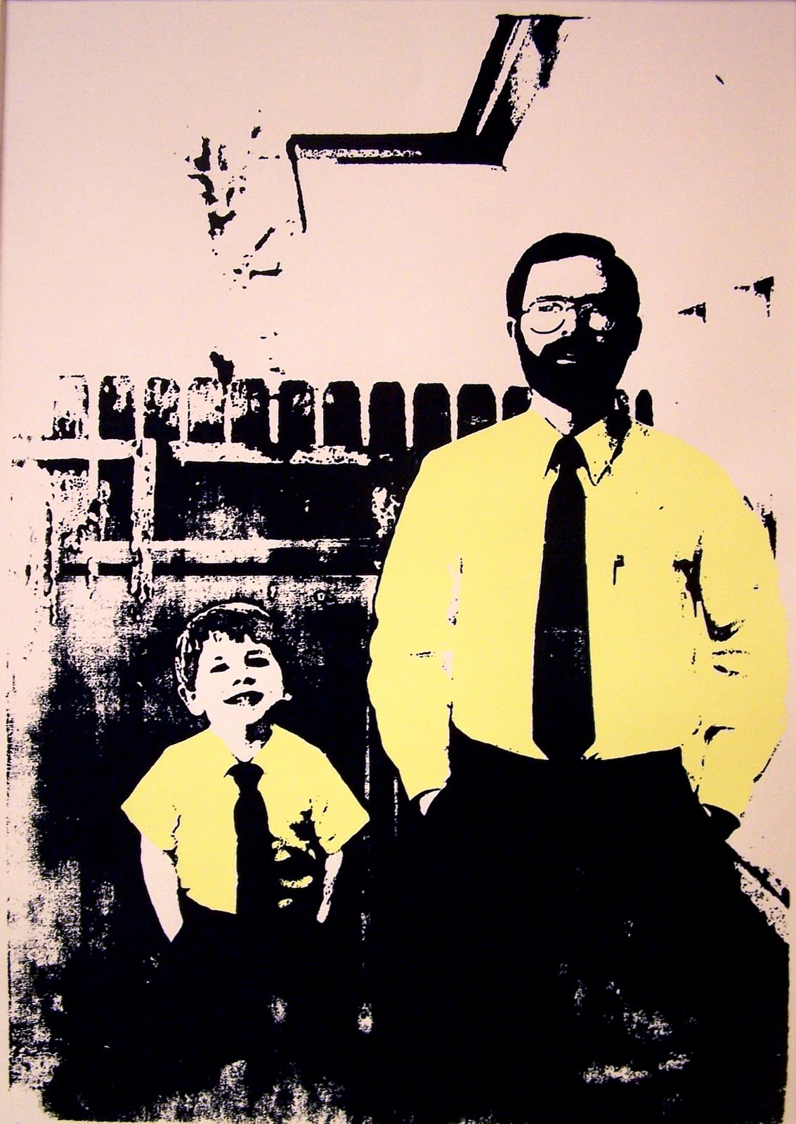
Jessica named her thesis exhibition Entropy.
she presented her prints in diptychs, meaning two prints share a similar name and are related to one another, most commonly by subject matter. 
the first diptych is called Alienation.
the next diptych is called Dereliction.


her next diptych is called Deterioration.

the final diptych is called Entropy, and shares its name with her exhibition.
i love these prints.  i think that my favorite element has to be the line quality.  at first glance, the lines seem rigid and precise, but on closer inspection, they come to life.  each line, though tight has great gestural quality.  the aquatint (shading) on these prints is testament to the time and effort that Jessica put into these pieces.  
i know what you're thinking.  and yeah, i think they're for sale. but you should probably ask her. here's her email address: jessbeeman@gmail.com
tell her ross sent you.  she'll know what it means.

Saturday, June 26, 2010

Prints 101: Artist Statement Part Deux

I love reading Ross' artist statement. If you have ever been in a social situation with Ross you will most likely hear some of the stories he depicts, embellishments and all. Get him jolly and hear him talk.


Most of my work is based on elements of the home, both decorative aspects and the memories we make in them. Perhaps its the cottage lady in me, or maybe its that I have grown up in one of the most architecturally diverse cities in the world, but I love special details that make a dwelling personal.

I was going to post my artist statement from thesis but I don't really think it applies to me anymore. While I still dabble in the production of pattern and distress, I think my current studio situation (or lack there of) is forcing my interests to move towards a cleaner design style... Or maybe my mother is just impressing upon me that I can't make a mess on her dining room table.


So here is where I was. My wallpaper from thesis is where it brought me to, but here is some idea of where I see myself going... I am being heavily influenced currently by the giant bridal machine of everlasting happiness. It is inevitable that art will imitate life so I would rather keep things pleasant and stick with my dream landscape of color, music and love than harp on the fact that nothing make you feel chubbier than putting on a white dress.

Color, color, color. Thats where I'm heading.

Further posts as events warrant.

Thursday, June 24, 2010

Prints 101: Artist Statement

Sauce and i are hard at work getting Cage Free Press up and running. we reserved cagefreepress.com, and as soon as we figure out how to make it host this blog, it will be up and running.  we're also working on putting together some awesome business cards that are gonna blow some minds.
in the mean time, we thought we'd post our artist statements, just to give yall a heads up on what our individual work is all about.  here's mine.  enjoy!  feel free to ask questions or make unreasonably large donations. ;)

­­My prints represent an oral history and explore the effects of nostalgia on storytelling, memory and emotional attachment.  As a storyteller, I am prone to embellish the facts and bend the truth in an attempt to make my tale more entertaining.  As time passes and these stories are repeatedly told, my embellishments become an integral part of the story, and in turn, redefine the memory and my attachment to it.  The end result is an idealized and elaborate tall tale that I use to captivate an audience.  I want my work to capture the viewer in the same way.
I choose to create the majority of my prints using relief methods because they allow my drawing style to define the work.  Hand printing results in movement and variation within the ink, giving each print a unique surface quality, which I find aesthetically pleasing.  I choose to print large-scale in order to convey the larger-than-life nature of the story and the empowerment of memory.  Furthermore, I enjoy the physical demands of both relief printing and creating large-scale work.
Through my work, I want to show the viewer memories ­­­of stories that have shaped the way I recall and retell my personal history.  I want them to see imagination and nostalgia at work.  I want to entertain the viewer and remind them of their own incredible stories.

Tuesday, June 15, 2010

An Inviting New Opportunity

After what has probably been the longest work week of my life, I am finally gearing up for a few days off. We had a bridal event at the stationary store/bridal boutique where I work and it essentially ate up all my time. But, we have something to show for it. The store looks beautiful. Drop by if you are in the neighborhood.

Tomorrow (June 16th) is also my 25th birthday. Its quite shocking to say it out loud. I feel like I am entering the realm of real adulthood, which is different than the false sense of adulthood that college brings you where you start making life decisions, like which brand of toilet paper to buy or when you realize you like a brand of coffee that is different than what your parents drink. I'm entering the big leagues.

I can rent a car.

But its kinda nice. So many of my friends are hopping on the train to adult land too. And we are all planning weddings. I have found that weddings are ripe for the freelance design pickin'. When you start thinking about all that goes into them; save the dates, invitations, reply cards, social stationary, monograms, place cards, menus, programs, thank you notes... there is so much paper in weddings. My dear friend and sorority sister, Kelly has been the guinea pig for the majority of the wedding design work I have done so far. I am eager to do more though. I have even asked for a Pantone Bridge for my birthday (its a color picker that helps standardize what colors print no matter where you print from. Its a nerd thing.)
This was Kelly and Marc's save the date magnet (obviously some info has been blurred to protect their privacy). They had some amazing photography to work with and it was my absolute pleasure to set a tasteful amount of text to it. When they first got engaged I created this false invitation for my portfolio:

As you can see this set up is dramatically different from the funky, clean, modern design style that their wedding wound up taking but I love doing anything. It so cool to me to see the different ways that some people can use design elements to really personalize their wedding. I'm happy to report that more and more people are moving away from black ink on ecru cards.

I honestly can't wait to see what Ross and I come up with for ours. Rest assured, it will be awesome. But in the meantime, if you are engaged or know someone who is and you need a little design work done, contact me. I'm starting to really like wedding invitations.


Saturday, June 12, 2010

Cage Free Press and You

ladies and gents, the Sauce Mopps has had one heck of a week, earning real money and preparing to support me, the struggling yet incredibly talented artist. so even though it's her turn to post, i'm gonna take the reigns on this puppy and hit yall with some knowledge.


i know what you're thinking: "Cage Free Press is so cool! how do i get in on this action? what's a fella gotta do to own a Cage Free original?!" well, keep your pants on and i'll tell you. and by the way, it's easy. all you have to do is give us your money!
currently, there are two ways to become the lucky owner of Cage Free artwork that is sure to impress your friends and family, and ensure that your date is thoroughly impressed with your taste in local art. (chicks dig it)
the best way to get original, personal artwork, is to talk to us about having a photo turned into a lovely silkscreen print. like these:


this print is called Bushel Britches.

this print is called Red Meat Will Put Hair On Your Chest.

so, you want one. its cool, dude! we can fix you up. let's talk shop.
here's a few things you should look for in a photo to make this thing go smoothly:

1. the photo needs a good deal of contrast. for example, in Red Meat the two figures are in the foreground with very distinguishable shirts and pants. in Bushel Britches, the swimming trucks and popsicle stand out against the dull pavement.
2. the photos need a quiet background. while the two projects you see above are not devoid of background information, they aren't crowded by, say a chain link fence, where a distinct pattern would flatten the image.
3. make sure the photo is in focus, devoid of scratches, and make sure the overall color is good. you know how photos from the 70's just look kind of yellow and brown? they look cool, but they don't make a good silkscreen print. i know, kinda sucks.

so what do we need from you?

1. we need you to pick out at least 4 photos, so we can look through them and discuss with you which one will be the most successful.
2. scan in those photos at a high resolution, and email us jpeg copies.
3. look at regular frame sizes to get an idea of how large you would like your print to be.
4. think about how many colors you would like: anywhere from 1 to 4.
5. after we talk about which photo will be the most successful, come up with a cool name for your print.

after all that, we'll talk about pricing, and while we ain't cheap, you will get your money's worth.
here's our first completed commission piece, called Sydney Boo.


in the not-too-distant future, Sauce and I will be uploading our personal portfolios with artwork for sale onto our blog as well as an Etsy account, where you can spend money to your heart's content.
knowledge is power.

Wednesday, June 9, 2010

props to my homeboys

not even a week into this blogsperience, and i've already hit writer's block. 
i blame the oil spill. 
so... instead of another entry cataloguing my excellence, i have decided to talk a little about my influences and inspirations.


Bill Watterson's Calvin & Hobbes had a profound influence on me.  even before i could read, i looked forward to getting the full color comic section of the Sunday paper.  i would look at the illustrations and do my best to figure out what was going on.  Mr Watterson animated the story so well, i was able to follow the story fairly well, for an illiterate.  i can even remember the first time i picked up the comics, searched frantically for the Calvin & Hobbes strip, and discovered that the strip had been retired.  newspapers have been dead to me ever since.  no Calvin & Hobbes?!  why even bother?  
my drawing style has always leaned toward animation, and that's in large part because i spent so much time drawing and tracing Bill Watterson's work.  
there's a video documentary in the works right now, called Dear Mr Watterson.  its about artists who consider Calvin & Hobbes to be a major influence on their artistic vision. check it.

i first discovered Frank Miller's work in college, as i was taking my first art classes, after my red shirt freshman year.  i bought the first Sin City graphic novel, The Hard Goodbye, and read it in a day.  by the end of the week, i had bought the whole set.  i absolutely loved the way he told such a dirty, gritty story in stark black and white.
the artwork is simply incredible.  after i carved my first woodcut, i fell in love with the style of Sin City all over again.  it was like he drew in relief.  his ability to tell such incredible stories also astounded me.  i read his novel, The Dark Knight Returns, 6 times in a month.  its still one of my absolute favorites.  

here recently, i have started collecting Mike Mignola's Hellboy.  his stories are a wonderful blend of local folklore and his own personal folklore.  i'm always surprised by his use of color and subtle background imagery.  like birds with piercing eyes, or crosses covered in vines.  Hellboy's cool demeanor in the face of otherworldly threats who call for him to take his rightful place as the bringer of the apocalypse is almost comical.  its a powerful, well thought-out body of work that continues to grow stronger with every new story.  

up until my thesis, i was embarrassed to say that after years of art history classes and visiting artist lectures, i am still most heavily influenced by comic book illustrations.  especially super hero comics.  i'm not sure why.  these guys are awesome.  so, i threw out the "high art/low art" argument and realized that i can no more control what moves me than i can control Sauce's undying love for Hanson. 

knowledge is power.

Monday, June 7, 2010

Prints 101: Giclee Prints

There are some printmakers who will tell you that giclee's should not be considered a fine art process, and they may be right. At its simplest, a giclee print involves taking a digital file and printing it out with an ink-jet printer. Now with this definition one could argue that the pictures I used to print out off the internet of Zac Hanson for my "HANSON RULES" scrapbook were essentially giclee's. I, however, would like to offer a more specific definition. A giclee print is a fine art print from a digital source that is printed from an ink-jet printer using archival inks (ink that wont fade over time) and is printed on a suitable medium such as fine paper or canvas.

A standard ink-jet has one cartridge with 4 inks. Cyan, magenta, yellow and black. Believe it or not, the combinations of these four colors brings to life practically all of the printed material you see. My thesis show was a collection of giclee prints. My wallpaper I created and every one of the interchangeable design elements were printed from a massive Epson printer that had 8 separate archival ink cartridges that were suitably blended to create ever color of the rainbow.


Now if you are not impressed with this behemoth of a machine, let me give you an idea of scale for this image printed: that paper is over three feet wide and each panel printed was eleven feet tall.


I really enjoyed working in this capacity. I could take all the endless color options from the computer and transpose them perfectly onto fine cotton paper. There is substance to these prints. Alternatively for artists who do a limited run of a physical print (like a woodblock or one of Ross' insulation foam prints), they can scan or photograph their original image and print copies of their work. These are less laborious and demand less manpower to produce so they can be sold at a much lower price point. They can also be scaled down digitally to accommodate smaller spaces. But my favorite perk of the giclee print is that it give graphic artists, like myself, a little bit of clout in the gallery. By being able to produce work digitally (which can involve as much drawing as a litho plate) and print it out on something nicer than computer paper.
There is undeniable talent in graphic artists. They are receiving more gallery attention abroad currently than they are in America. But I think in years to come the price point, and the availability will make them more and more attractive to American buyers. The print above is by American artist and animator Kristen Ulve. I looooove her work. On canvas, measuring 38" x 57" her print "Geisha" will set you back $250 plus shipping. This is way less expensive than the original painting which is $3,200.

Now you know.


Sunday, June 6, 2010

Day Off!

School will be back in session come Monday. Tomorrow I will discuss Giclée prints. For today's entry, Ross and I are going to tell you what we have done on our day off.

I'm beginning to love Sundays. With my new work schedule, it is the only day of the week where I don't make an appearance at the store. Our power went out last night, so everyone in the house slept late. When I finally slithered out of bed around 10, I shoved some cereal in my mouth, threw on a clean shirt and grabbed my brother to head out to Wal-Mart. After picking up a balanced diet of Brown Sugar Pop-Tarts and fruit snacks we headed over to GameStop. When my brother was little it was a far more convenient excuse for me to play games and watch cartoons without it looking as though they were things I wanted to play or shows I wanted to watch. The older he gets though I am finding fewer occasions for such an excuse so its just come down to me admitting that I like to watch Dragonball Z and asking him if we can go to GameStop while we are out. Gladly, he obliges. Since he was in middle school we have been looking at the game Kingdom Hearts (yes if he was in middle school it meant I was in high school...whatever). Its a critically acclaimed game that was released in 2002 for the PS2. Never being able to justify a $49 price tag for a video game I buy all of mine used (unlike some slaves to the new, like the one I'm marrying), so I was pleased to see the game we had long since wanted for only $16. We bought it.


Taking turns with this one player game, my brother and I spent 4 hours after lunch playing in this beautifully animated, Disney themed world while my mom sat on the couch and knitted. If i didn't know better I would have thought it was 2002 and at any moment my mom was going to ask me if I had any homework for Mr. McLetchie's class. The gameplay is fairly simple with little tasks to accomplish and you meet lots of Disney characters who are breaking the rules of their respective universes and showing up in unexpected places. I think the biggest appeal of this game for me is the artestry of the animation. There are these giant stained-glass panels that appear showcasing each of the Disney princesses. The resemblance to some of the work by Czech Art Nouveau artist Alphonse Mucha is just startling:


It was around six that my mom said the most interesting thing;
"You know what I'm craving?"
"What?" I responded.
"Nachos Bell Grande from Taco Bell."
And suddenly, I was too...

Best day-off ever.


my day was fairly similar to the Sauce's. i rolled out of bed waaay too close to noon. my parents would have been ashamed. to make up for lost time, i took part in the time-honored tradition called No Shower Sundays. also somewhat shameful, but necessary. after eating some grub with family here in oxford, i spent the majority of my day playing Red Dead Redemption on the PS3.


its a great game with a huge map to explore, a deep and tangled web of a plot line, and everything a gunslinging outlaw could want. i don't want to give away the ending, so i'll just say that today i rode all over Texas and northern Mexico, brandishing my trusty blue steeled beauty and pulling off hip shots, saving damsels in distress, mowing down gangsters, finding buried treasure, and shooting a guy's sombrero right off his head (which was not well-received). and that's just the stuff the game wanted me to do!
i also accidentally sent my horse flying off a cliff, twice. i had whistled to it so it would come give me a ride, and the stupid thing decided to just jump right off a cliff to get to me. dumb. AND i blew myself up shooting at a barrel of TNT. it was a bad scene.
carnage aside, the game is really fun to look at. the landscapes are beautiful, the plants look real, and there's wildlife just kickin around.

i'm not too sure how this game related to my design style, other than the cover art. i know is a vector image, but it looks like a linocut! and the font looks hand printed. the in-game wanted posters have that same feel. i think i just love the nostalgia of this game. the same way i love the historic nature of printmaking. there's something really appealing about being surrounded by history and reliving it.

Saturday, June 5, 2010

Prints 101: Relief Printing

like my feeeyawnsay said. different strokes for different folks (rest in peace Gary) when it comes to printmaking.  like most guys my age, most of my early exposure to artistic endeavors came in the form of animated films or saturday morning cartoons.  my brother and i used to watch this tv show called McGee and Me. this kid named Nick has this baller pencil sharpener that was set up like a Rube Goldberg project. he would draw this character named McGee in a red notebook, and McGee would come to life and teach him life lessons: like don't make fun of native americans or talk trash to dudes with a knife hanging out the tip of their cowboy boot. 
my mom bought me a notebook just like his, and i filled it full of superman stories and all kinds of crazy stuff. drawing and storytelling go back to my most basic artistic experiences. while any printmaking form can showcase your drawing skill, there's something special about relief printing that shows the hand drawn aspect of the work so well.  
relief printing started in china in the 3rd century AD. its older than the Great Wall. word.  woodblock printing is mostly recognized for the work of Hokusai, especially this little ditty:
the Great Wave Off of Kanagawa.  if i could ever summon the courage to get a tattoo, you're looking at it.  its absolutely beautiful.  after the Japanese rocked the woodblock out, the Germans took a swing at religious imagery, and then the Renaissance greats, like Durer, leaned with it and rocked with it. and then there's me. 
here's a look at the set of tools i use for relief work:
each tool leaves a very specific mark. like a fingerprint. its fascinating.
                                                                     
after inking the block and placing paper onto the block, i print by hand using a series of tools.  i'll use anything from a box of cat litter to a handmade wooden spoon.  like so:
after my arms get too tired to keep going, i check the print, if it looks like a masterpiece, i remove the paper from the block.
                                           
boom.  knowledge is power.


Friday, June 4, 2010

Prints 101: Screen Prints

As students of printmaking, Ross and I have both been trained in several different printing processes. Naturally, different people excel in different areas, and thankfully that is the case with our preferred mediums. In my first printmaking class (back in Spring 2006, wow) I was very interested in taking the clean designs I was accustomed to creating on the computer and producing them in new ways, by hand. I quickly discovered with relief printing processes (Ross' specialty) there was no "Undo Button." (For those of you with Adobe Illustrator experience, "Command Z" became my mantra as I hacked away at woodblocks.) When I was introduced to screen printing that fall, everything changed. I could finally take photographic image and combine it with computer editing and produce handmade consistency.

Screen printing, or some form of it, has been around since 960 AD starting, naturally, in Asia. As silk became more available to western continents so did the process. Because of the processes ability to reproduce images consistently and effectively, its commercial use has long outweighed its artistic use. In the 1930's the National Serigraphic Society developed the term "Serigraphy" to distinguish artistic pursuits in the medium. This term didn't garner global respect until Andy Warhol popularized the process with a certain image that is so iconic I won't even bother to post a copy (because you know the one.)

Screen printing is the most versatile process in printmaking because it can be done on practically any surface. By using either a stencil or light sensitive emulsion a negative image is produced on a mesh screen.


When ink is pushed through the screen in the areas that are not blocked by stencil or emulsion the image is passed onto paper. (In these photos this is the light sensitive emulsion.) So now you know. When we refer to a screen print on here this is the process we are talking about. Ink being pushed though a mesh screen.


Aaaaaand here's a picture of Ross looking irritated:
Knowledge is power.

Thursday, June 3, 2010

its my first time

i don't blog. in fact, i don't think i've ever some taken time to look at blogs. my complete lack of experience with blogs (blogsperience) and being engaged to a Cottage Lady, is going to make this an adventure.   
for those of you who know Sauce well, its hard to imagine that the same kid who will wear a space camp t-shirt and moon boots could be so attracted to all the frilly little things she adores so much. its incredible, hilarious, fascinating and bizarre all at the same time.  i never know what to expect. Sauce has a love for everything from fine art, to art that i can only describe as "soul-crushingly cute." i did my best to scale back some of the cute factor. so far, no butterflies or hearts have surfaced, but its only day two.  and look at what i'm working with!
my vision for Cage Free Press is, obviously, a little more masculine.  i couldn't find any backgrounds featuring bears or steaks, nor could i find any cool pictures of bears eating steak. so this will have to do for now.  i have visions of woodcuts and letterpress dancing in my head. that's my ultimate goal: become filthy, stinkin rich making awesome prints that i would do for free if i didn't like money so much.


the irony of the situation is, all our commission work thus far has been ordered by wives or brides or moms, and its all been cute- in a nice way. nobody has asked for a rainbow covered in butterflies and unicorns, but then again, Sauce wouldn't commission me to make that, she'd just do it herself. but her vision of what Cage Free is or should be is closer to the truth than mine. dudes aren't coming out of the woodwork asking for a woodcut of two men giving each other a high five, but mamas want prints of their babies! and we're more than happy to make it happen.


so for now, this blog will showcase our commission work, our influences, and the ensuing hilarity of the two of us trying to mesh our vision for this experience. enjoy the ride. donations are encouraged. ;)

Wednesday, June 2, 2010

Hazah!

We did it. It took us nearly three hours, but we finally came to some sort of an agreement on the layout for this blog. For two people with so much in common we have dramatically different opinions when it comes to design. In many ways, it serves as a nice check and balance when we are tackling projects, but sometimes his inner techno-gadget-man-made-of-stainless-steel butts heads with my inner cottage-lady-who-thinks-a-doily-would-really-look-swell-under-that-floral-vase.

It can get complicated.

Thankfully he only made this face once:


But we are excited about the blog, really. I think it will be a nice exercise in teamwork and compromise. I really can't wait to see what we do next.