Showing posts with label comission. Show all posts

Tuesday, June 15, 2010

An Inviting New Opportunity

After what has probably been the longest work week of my life, I am finally gearing up for a few days off. We had a bridal event at the stationary store/bridal boutique where I work and it essentially ate up all my time. But, we have something to show for it. The store looks beautiful. Drop by if you are in the neighborhood.

Tomorrow (June 16th) is also my 25th birthday. Its quite shocking to say it out loud. I feel like I am entering the realm of real adulthood, which is different than the false sense of adulthood that college brings you where you start making life decisions, like which brand of toilet paper to buy or when you realize you like a brand of coffee that is different than what your parents drink. I'm entering the big leagues.

I can rent a car.

But its kinda nice. So many of my friends are hopping on the train to adult land too. And we are all planning weddings. I have found that weddings are ripe for the freelance design pickin'. When you start thinking about all that goes into them; save the dates, invitations, reply cards, social stationary, monograms, place cards, menus, programs, thank you notes... there is so much paper in weddings. My dear friend and sorority sister, Kelly has been the guinea pig for the majority of the wedding design work I have done so far. I am eager to do more though. I have even asked for a Pantone Bridge for my birthday (its a color picker that helps standardize what colors print no matter where you print from. Its a nerd thing.)
This was Kelly and Marc's save the date magnet (obviously some info has been blurred to protect their privacy). They had some amazing photography to work with and it was my absolute pleasure to set a tasteful amount of text to it. When they first got engaged I created this false invitation for my portfolio:

As you can see this set up is dramatically different from the funky, clean, modern design style that their wedding wound up taking but I love doing anything. It so cool to me to see the different ways that some people can use design elements to really personalize their wedding. I'm happy to report that more and more people are moving away from black ink on ecru cards.

I honestly can't wait to see what Ross and I come up with for ours. Rest assured, it will be awesome. But in the meantime, if you are engaged or know someone who is and you need a little design work done, contact me. I'm starting to really like wedding invitations.


Saturday, June 12, 2010

Cage Free Press and You

ladies and gents, the Sauce Mopps has had one heck of a week, earning real money and preparing to support me, the struggling yet incredibly talented artist. so even though it's her turn to post, i'm gonna take the reigns on this puppy and hit yall with some knowledge.


i know what you're thinking: "Cage Free Press is so cool! how do i get in on this action? what's a fella gotta do to own a Cage Free original?!" well, keep your pants on and i'll tell you. and by the way, it's easy. all you have to do is give us your money!
currently, there are two ways to become the lucky owner of Cage Free artwork that is sure to impress your friends and family, and ensure that your date is thoroughly impressed with your taste in local art. (chicks dig it)
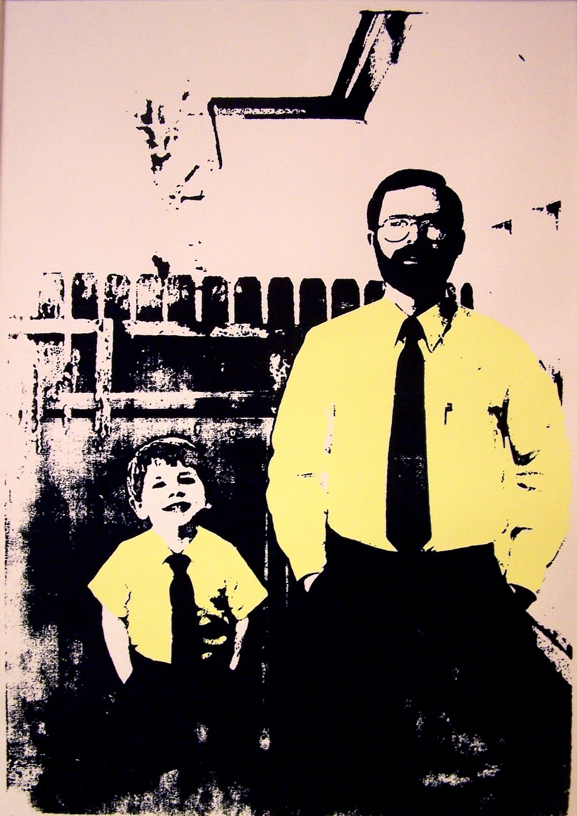
the best way to get original, personal artwork, is to talk to us about having a photo turned into a lovely silkscreen print. like these:


this print is called Bushel Britches.

this print is called Red Meat Will Put Hair On Your Chest.

so, you want one. its cool, dude! we can fix you up. let's talk shop.
here's a few things you should look for in a photo to make this thing go smoothly:

1. the photo needs a good deal of contrast. for example, in Red Meat the two figures are in the foreground with very distinguishable shirts and pants. in Bushel Britches, the swimming trucks and popsicle stand out against the dull pavement.
2. the photos need a quiet background. while the two projects you see above are not devoid of background information, they aren't crowded by, say a chain link fence, where a distinct pattern would flatten the image.
3. make sure the photo is in focus, devoid of scratches, and make sure the overall color is good. you know how photos from the 70's just look kind of yellow and brown? they look cool, but they don't make a good silkscreen print. i know, kinda sucks.

so what do we need from you?

1. we need you to pick out at least 4 photos, so we can look through them and discuss with you which one will be the most successful.
2. scan in those photos at a high resolution, and email us jpeg copies.
3. look at regular frame sizes to get an idea of how large you would like your print to be.
4. think about how many colors you would like: anywhere from 1 to 4.
5. after we talk about which photo will be the most successful, come up with a cool name for your print.

after all that, we'll talk about pricing, and while we ain't cheap, you will get your money's worth.
here's our first completed commission piece, called Sydney Boo.


in the not-too-distant future, Sauce and I will be uploading our personal portfolios with artwork for sale onto our blog as well as an Etsy account, where you can spend money to your heart's content.
knowledge is power.