Wednesday, July 21, 2010

Rest In Peace, He-Man Woman-Haters Club

not being in school kinda sucks.  nobody wants to pay me millions of dollars to make prints, reality tv shows aren't beating down my door to follow me around and catch my wacky antics on tape, New Balance doesn't want to give me an endorsement deal (although i have been a loyal customer even when their shoes look goofy) and no one seems to want to let me live in their mansion for free.  
i think my perception of the real world might have been a little off-base... i had no idea everything cost so much money.  and did you know you have to pay back student loans?!  what's that all about?  if i had the money, i wouldn't have taken out the damn thing in the first place!
similarly, i've come to realize that this "summer" hasn't been a summer at all:  i'm just unemployed.  so, since all this stuff i need costs money or whatever, i've been trying to find a job.  my search has been geared mostly towards new orleans.  Sauce is down there, and i figured it would be easier to find one job than it would be to find two new jobs somewhere else.  and with all the luck i've had thus far,  finding two jobs would be just short of impossible.
but it's all good.  i'll find something.  or to put it another way, some business down in new yorleans city is gonna look back on the day they hired me as the beginning of an incredible chapter in their existence.  i can't wait to find out who they are.  
i feel like my future landlord will have that very same feeling, as soon as i find an apartment i can afford in a neighborhood where i won't get murdered.  once again my ignorance of the real world has reared its ugly head.  i suppose watching more HGTV with Sauce would have shown me how people try to peddle tiny basement apartments for $1100 a month plus utilities, but i just can't watch that channel, guys.  i just can't.   
you should see some of these ads for rentals.  "small basement crawl space for rent. $1200 plus utilities.  great neighborhood.  very few stabbings.  even less kidnappings.  acceptable murder rate."    living down there is gonna be wild.  good thing i'm not ever scared.


speaking of dwellings, on my way down to the crescent city, i stopped by my house to grab a few things and play with the dogs for a while.  and i remembered that we had to take the treehouse down not too long ago.  the tree limb it was perched on was starting to give way under its weight.  i hadn't seen it since the tree was cut down, and it was kind of sad, seeing the great He-Man Woman-Haters tree fortress reduced to a lowly shed.  because that treehouse was awesome.  it had a batpole, a rope ladder, a zip cord, a trap door... WE HAD IT ALL!  
it's another reminder that i need to preserve the majesty of childhood through my work.  so i took a few photos of the remains with my phone using the hipstamatic app.  i also got started sketching for new treehouse prints.  stay tuned!


Wednesday, July 7, 2010

Work of Art: The Next Great Artist

I finally had a night to myself this evening where the decision of what to watch on TV was up to me, and me alone. This is a rarity since I have moved home. The entertainment choices are typically made by those who purchased the TV and pay for the cable. But tonight the power was in my hands and so I noshed on some smoked salmon and rice and watched one of my favorite movies (A Life Less Ordinary, 1997). Once that was done, all that was left was one slice of
cheesecake and cable television.

I have had multiple people tell me that I need to watch "Work of Art: The Next Great Artist" on Bravo. For those who don't know, it is essentially Project Runway but for artists. They are given an outlandish assignment (typically sponsored by some fabulous brand or corporation, tonight was Audi) with an unrealistic time constraint. The ultimate goal is for each participant to create a masterpiece by the end of the episode. I can say confidently that I wont be watching weekly. Beyond the ridiculous standards by which these artists are being judged, I just don't think I need the anxiety of whether or not they are going to pull it off.


By all rights, sharing studio space and being in the art department created bonds for me stronger than any other group I was associated with in college. The only other people who I really think know me better on a personal level are the girls who I went to McGehee with (thanks to forced bonding excursions like Space Camp and Katalehia). Hell, my art department bonds are so strong I am MARRYING a fellow Meek Freak. Perhaps its being in the hot seat together every time a project is due, or maybe its letting a room full of strangers in on your deepest feelings during critique but there isundeniable comradery amongst us. Even if you don't like someone, you can respect their work. Then again, maybe this is the blurred nostalgia of an alum...

It was amazing watching the contestants on Work of Art say things that we would say in studios:
"Does anyone know where the xacto blades are?"
"Do you have any duct tape?"
"Is he still asleep?"
"Do you ever take dry brushes and just blur shit? Bob Ross taught me that..."

I don't know, it isn't a bad show by any means, and I loved Project Runway, but I think the title of "Next Great Artist" is a little much. It should be something more like, "Next Individual Who Works Really Well Under Pressure, Makes Generally Pleasing, But Not Boring Work And Doesn't Make A Mess In The Community Bathroom."

And now for something completely different:


yay!

Wednesday, June 30, 2010

Cage Free Contemporaries: Jessica Beeman

ladies, gentlemen and Cage Free Junkies:
here's the scoop, yo.  between Sauce's extended hours at her place of work and my frantic search for the right bridge to live under, we haven't made a lot of new work.  SO i came up with the brilliant idea to promote some of our incredibly talented friends.  for free!  i know, i'm a great guy.  Sauce is a lucky woman.


the first edition of Cage Free Contemporaries features Jessica Beeman, a fellow printmaker from the University of Mississippi.
this kid is talented.  her thesis work is really impressive.  the line work and attention to detail in the imagery are just spectacular.  her artist statement and each print's title add a somber, introspective  note to the work that draws you in. check out her artist statement:

"I feel an attraction to abandoned buildings.  They have outlasted their usefulness.  They are dirty and decayed.  I find a voyeuristic thrill in being the first in years to enter their bodies and explore their insides.  That thrill gives way to anxiety when discovering time's dismantling effects on the structure.  I am reminded of my own body, and its inevitable decay.

The exposed supports of this building were like bones.  The flesh had long rotted away.  The wood was cracked and weathered, and the wrought iron beams were rusted through.  The entire structure seemed to teeter on the edge of collapse.  It is hollow save a few disintegrating boxes and pieces of trash.  It appeared the soul had long departed from this stripped skeleton, though I could still feel it lingering there.

Rather than produce perfectly accurate representations of the building itself, I create portraits of the melancholy and heaviness of the atmosphere inside.  The images depict the moments in time frozen within the walls, and the profound loneliness that thickens the air.  It is a sobering fact that our bodies are just as vulnerable to the passage of time.  My prints are reminders of the ephemerality of our lives and the ease with which we are forgotten."

Jessica named her thesis exhibition Entropy.
she presented her prints in diptychs, meaning two prints share a similar name and are related to one another, most commonly by subject matter. 
the first diptych is called Alienation.
the next diptych is called Dereliction.


her next diptych is called Deterioration.

the final diptych is called Entropy, and shares its name with her exhibition.
i love these prints.  i think that my favorite element has to be the line quality.  at first glance, the lines seem rigid and precise, but on closer inspection, they come to life.  each line, though tight has great gestural quality.  the aquatint (shading) on these prints is testament to the time and effort that Jessica put into these pieces.  
i know what you're thinking.  and yeah, i think they're for sale. but you should probably ask her. here's her email address: jessbeeman@gmail.com
tell her ross sent you.  she'll know what it means.

Saturday, June 26, 2010

Prints 101: Artist Statement Part Deux

I love reading Ross' artist statement. If you have ever been in a social situation with Ross you will most likely hear some of the stories he depicts, embellishments and all. Get him jolly and hear him talk.


Most of my work is based on elements of the home, both decorative aspects and the memories we make in them. Perhaps its the cottage lady in me, or maybe its that I have grown up in one of the most architecturally diverse cities in the world, but I love special details that make a dwelling personal.

I was going to post my artist statement from thesis but I don't really think it applies to me anymore. While I still dabble in the production of pattern and distress, I think my current studio situation (or lack there of) is forcing my interests to move towards a cleaner design style... Or maybe my mother is just impressing upon me that I can't make a mess on her dining room table.


So here is where I was. My wallpaper from thesis is where it brought me to, but here is some idea of where I see myself going... I am being heavily influenced currently by the giant bridal machine of everlasting happiness. It is inevitable that art will imitate life so I would rather keep things pleasant and stick with my dream landscape of color, music and love than harp on the fact that nothing make you feel chubbier than putting on a white dress.

Color, color, color. Thats where I'm heading.

Further posts as events warrant.

Thursday, June 24, 2010

Prints 101: Artist Statement

Sauce and i are hard at work getting Cage Free Press up and running. we reserved cagefreepress.com, and as soon as we figure out how to make it host this blog, it will be up and running.  we're also working on putting together some awesome business cards that are gonna blow some minds.
in the mean time, we thought we'd post our artist statements, just to give yall a heads up on what our individual work is all about.  here's mine.  enjoy!  feel free to ask questions or make unreasonably large donations. ;)

­­My prints represent an oral history and explore the effects of nostalgia on storytelling, memory and emotional attachment.  As a storyteller, I am prone to embellish the facts and bend the truth in an attempt to make my tale more entertaining.  As time passes and these stories are repeatedly told, my embellishments become an integral part of the story, and in turn, redefine the memory and my attachment to it.  The end result is an idealized and elaborate tall tale that I use to captivate an audience.  I want my work to capture the viewer in the same way.
I choose to create the majority of my prints using relief methods because they allow my drawing style to define the work.  Hand printing results in movement and variation within the ink, giving each print a unique surface quality, which I find aesthetically pleasing.  I choose to print large-scale in order to convey the larger-than-life nature of the story and the empowerment of memory.  Furthermore, I enjoy the physical demands of both relief printing and creating large-scale work.
Through my work, I want to show the viewer memories ­­­of stories that have shaped the way I recall and retell my personal history.  I want them to see imagination and nostalgia at work.  I want to entertain the viewer and remind them of their own incredible stories.

Tuesday, June 15, 2010

An Inviting New Opportunity

After what has probably been the longest work week of my life, I am finally gearing up for a few days off. We had a bridal event at the stationary store/bridal boutique where I work and it essentially ate up all my time. But, we have something to show for it. The store looks beautiful. Drop by if you are in the neighborhood.

Tomorrow (June 16th) is also my 25th birthday. Its quite shocking to say it out loud. I feel like I am entering the realm of real adulthood, which is different than the false sense of adulthood that college brings you where you start making life decisions, like which brand of toilet paper to buy or when you realize you like a brand of coffee that is different than what your parents drink. I'm entering the big leagues.

I can rent a car.

But its kinda nice. So many of my friends are hopping on the train to adult land too. And we are all planning weddings. I have found that weddings are ripe for the freelance design pickin'. When you start thinking about all that goes into them; save the dates, invitations, reply cards, social stationary, monograms, place cards, menus, programs, thank you notes... there is so much paper in weddings. My dear friend and sorority sister, Kelly has been the guinea pig for the majority of the wedding design work I have done so far. I am eager to do more though. I have even asked for a Pantone Bridge for my birthday (its a color picker that helps standardize what colors print no matter where you print from. Its a nerd thing.)
This was Kelly and Marc's save the date magnet (obviously some info has been blurred to protect their privacy). They had some amazing photography to work with and it was my absolute pleasure to set a tasteful amount of text to it. When they first got engaged I created this false invitation for my portfolio:

As you can see this set up is dramatically different from the funky, clean, modern design style that their wedding wound up taking but I love doing anything. It so cool to me to see the different ways that some people can use design elements to really personalize their wedding. I'm happy to report that more and more people are moving away from black ink on ecru cards.

I honestly can't wait to see what Ross and I come up with for ours. Rest assured, it will be awesome. But in the meantime, if you are engaged or know someone who is and you need a little design work done, contact me. I'm starting to really like wedding invitations.


Saturday, June 12, 2010

Cage Free Press and You

ladies and gents, the Sauce Mopps has had one heck of a week, earning real money and preparing to support me, the struggling yet incredibly talented artist. so even though it's her turn to post, i'm gonna take the reigns on this puppy and hit yall with some knowledge.


i know what you're thinking: "Cage Free Press is so cool! how do i get in on this action? what's a fella gotta do to own a Cage Free original?!" well, keep your pants on and i'll tell you. and by the way, it's easy. all you have to do is give us your money!
currently, there are two ways to become the lucky owner of Cage Free artwork that is sure to impress your friends and family, and ensure that your date is thoroughly impressed with your taste in local art. (chicks dig it)
the best way to get original, personal artwork, is to talk to us about having a photo turned into a lovely silkscreen print. like these:


this print is called Bushel Britches.

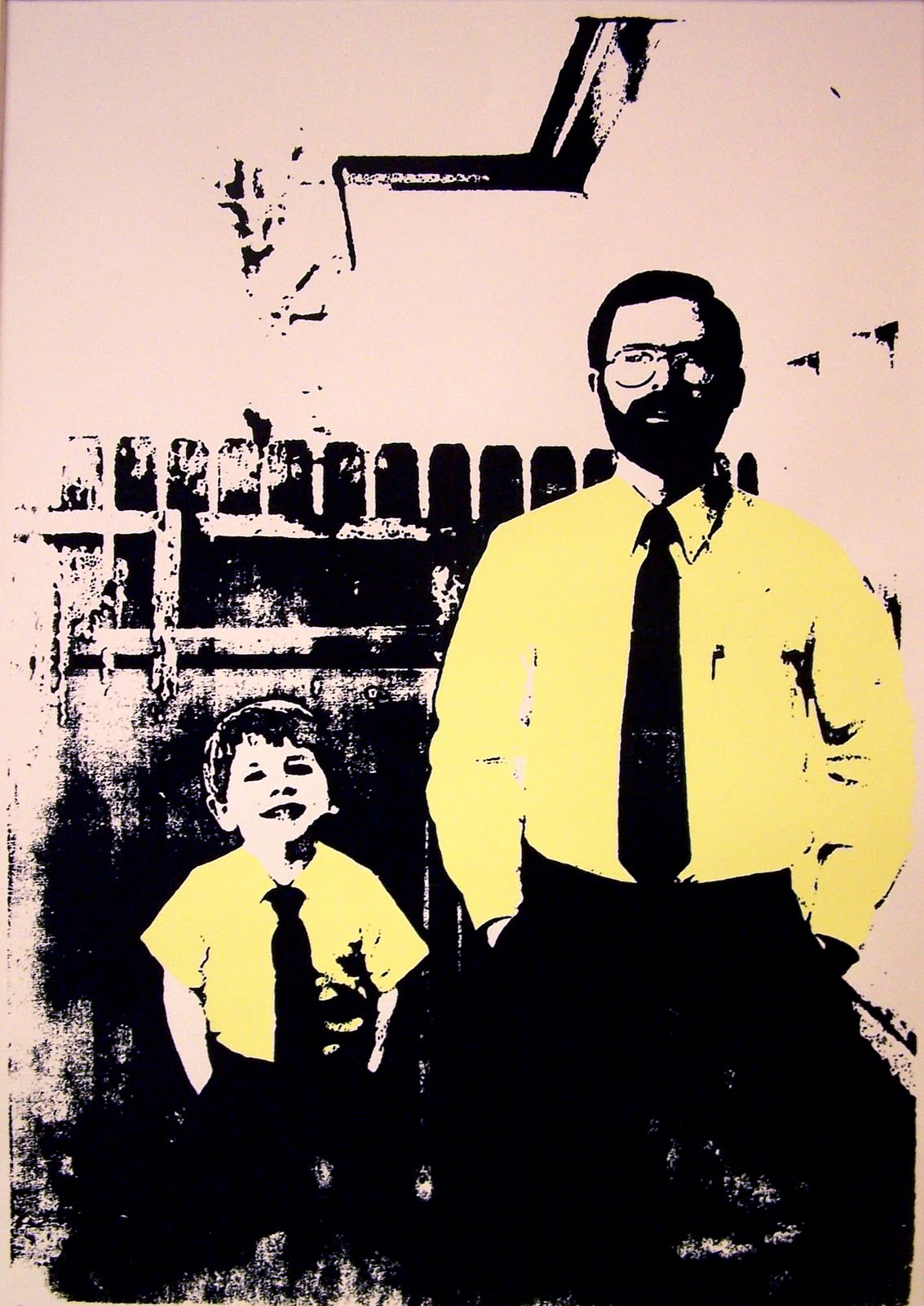
this print is called Red Meat Will Put Hair On Your Chest.

so, you want one. its cool, dude! we can fix you up. let's talk shop.
here's a few things you should look for in a photo to make this thing go smoothly:

1. the photo needs a good deal of contrast. for example, in Red Meat the two figures are in the foreground with very distinguishable shirts and pants. in Bushel Britches, the swimming trucks and popsicle stand out against the dull pavement.
2. the photos need a quiet background. while the two projects you see above are not devoid of background information, they aren't crowded by, say a chain link fence, where a distinct pattern would flatten the image.
3. make sure the photo is in focus, devoid of scratches, and make sure the overall color is good. you know how photos from the 70's just look kind of yellow and brown? they look cool, but they don't make a good silkscreen print. i know, kinda sucks.

so what do we need from you?

1. we need you to pick out at least 4 photos, so we can look through them and discuss with you which one will be the most successful.
2. scan in those photos at a high resolution, and email us jpeg copies.
3. look at regular frame sizes to get an idea of how large you would like your print to be.
4. think about how many colors you would like: anywhere from 1 to 4.
5. after we talk about which photo will be the most successful, come up with a cool name for your print.

after all that, we'll talk about pricing, and while we ain't cheap, you will get your money's worth.
here's our first completed commission piece, called Sydney Boo.


in the not-too-distant future, Sauce and I will be uploading our personal portfolios with artwork for sale onto our blog as well as an Etsy account, where you can spend money to your heart's content.
knowledge is power.